about the exhibit
overview
on view
public programs
projects
participants
images
multimedia
design
organizers
sponsors
credits
press info

At La Biennale di Venezia (2008)
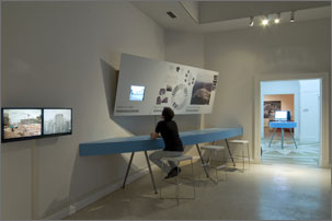
The installation of Into the Open: Positioning Practice in the U.S. Pavilion is itself designed as a space of productive community interaction, a space of social critique, and as a space of instruction.
The traditional divided axial symmetry of the building's circulation is reorganized into a circular flow by the addition of a continuous elliptical conference table, at which each exhibiting practice has a seat, starting outdoors in the garden and running through each of the galleries. A continuous storyboard above this table displays "how to" implement techniques for the community transformations exhibited. Small groupings of comfortable seating provide relaxed conversation areas as well as settings to view the varied video programs and print material produced by the exhibited practices.
In the Pavilion's Rotunda visitors to the exhibition are invited to join the project's blog, to add their comments on the exhibition and their own views on the social, economic and political issues that Into the Open: Positioning Practice explores.
-- Alan Bruton Studio and Julie Ault

At Parsons the New School for Design (2009)
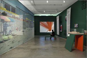
The design of Into the Open: Positioning Practice expands upon the participatory nature of the featured practices as well as the Kellen Gallery's mandate. The exhibition design is conceived as a multi-layered installation comprising several components: chalkboard painted walls, large stenciled texts, informally-arranged images, multiple digital projections, text banners and display furniture. Through their juxtaposition, these elements dynamically articulate current alternative architectural, artistic and educational practices and methods.
Large-scale artifacts and objects are placed specifically to highlight the multiple social perspectives contained within the exhibition. Given this complex spatial situation, the gallery visitor is invited to actively occupy multiple positions in order to engage with the form and content of the show. A central spatial element in the exhibition is Estudio Teddy Cruz's billboard-like representation of the Mexican-American border. In its original presentation in Venice, this scrim subverted the facade of the U.S. Pavilion: it served as a literal barrier through which the visitor had to pass in order to enter the national space. In New York, this banner has been repurposed to create a meeting and screening room. Within this new context, Cruz's piece is not a literal border crossing but rather a psychological space where the public can gather to exchange ideas about ever-shifting border situations.
Another primary object on display are planters for the Yale Sustainable Food Project, designed specifically for this show. These asymmetrical constructions respond to the Kellen Gallery's architecture and also to its street presence. This indoor "demo garden" is a departure from Venice; it now highlights urban food production that can take place on stoops, rooftops, fire escapes, window boxes or inside homes. The ongoing gardening of the containers will add a social component to the daily life of the exhibition.
Full-height banners visualize and spatialize the numerous discourses that inform the show. Foregrounding the exhibition's textual components encourages a conceptual understanding of the participants' approach and process -- often as important as their finished works. Through their scale and strong graphic presence, the banners allow the curatorial texts to make their case directly.
Cool Wool, designed by Alessio Leonardi and Priska Wollein in 1994, serves as the display typography for oversized associative phrases. The typeface merges a rational grid-like structure with an exceptionally imprecise form. Due to its matrix construction, Cool Wool can be spray painted by hand as an inexpensive stencil. This combination of typographic languages, contrasting refinement and rawness, speaks to the diverse mix of approaches within the show.
Immersive, bold, and interactive, the design of Into the Open seeks to emphasize the urgency and insight of these 16 practices' work. The curatorial intent is to inform -- but commentary and participation are essential. The gallery space, painted completely with green chalkboard paint, is an open forum for spontaneous feedback by visitors and students. We hope that you will take this opportunity to respond to the exhibition and add yet another layer to the mix: your thoughts, marks and voice.
-- Saylor + Sirola and Project Projects

At the National Constitution Center and Slought Foundation (2009)
Over the last twelve months, Into the Open has been situated in many different contexts: first in Venice as part of an international cultural spectacle, next in New York city at an urban pedagogical gallery, and now in multiple Philadelphia locations.
Simultaneous presentations take place at the National Constitution Center (NCC), an institution whose mandate is to "keep working to form a more perfect union," and at the Slought Foundation, a local collective art space focusing on "concepts for contemporary life." The combination of these two very different venues as well as extensive public programming outside of the exhibition spaces have the potential to connect diverse audiences and extend the life and messages of the exhibition. This unconventional organizational hybrid constitutes a localized informal infrastructure to yield both short and long-term results, creating new opportunities for citywide participation, dialogue, interaction, and engagement. This iteration may be the most appropriate forum to test the disparate civic ideas contained within the show and exhibition design.
Visible from across Independence Mall, Teddy Cruz's banner functions as both a mask for the National Constitution Center's facade and as a billboard advertising the show itself. The subversive content of this work is yet a further layer for exploration within this highly public context. The Edible Garden is strategically located just outside of the Constitution Center's cafe to pointedly demonstrate that there are simple local alternatives to institutional food production and consumption.
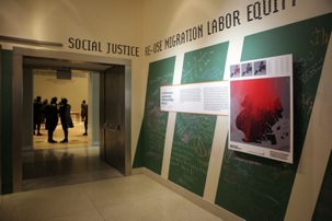
Within the permanent display at the NCC, we hope to produce a minor visual disruption as a way to engage not only our audience but also the mandate of the host institution. With an active nod to the self-initiative shown by many of the shows' participants, an under-utilized passageway has been boldly transformed into a temporary exhibition space--a super-graphic connector between Ralph Appelbaum Associate's theatrical permanent exhibition and Signers' Hall, a popular space containing life size bronze replicas of the men who drafted the Constitution.
The Into the Open exhibition within the NCC employs elements of the previous presentations--including graphic, typographic, and material content--but pushes them into closer dialogue with the site itself. Green chalkboard paint is applied in bold diagonal stripes that respond to the building's architecture and geometry, while also signaling urgency and inviting audience interaction. Painted "safety orange" accents further visualize the crucial nature of the show's multiple messages. A frieze of connected phrases, set in the exhibition's signature typeface, "Cool Wool," wraps the entire room. Flanking the permanent signage "To Ourselves and Our Posterity" outside Signer's Hall, the temporary words "Empowerment" and "Social Justice" insists upon the need to continually reinterpret the Constitution's mission and contemporary affects.
At Slought Foundation, an improvisational recycling and reformatting of previous exhibit elements reflects the approach of many of the show's participants, the exhibition's curators, and the venue's philosophy. This presentation serves as an informal counterpoint to the institutional context of the National Constitution Center.
In this current public display, we ask our audience with cautious optimism to not only think about civic participation within the gallery spaces themselves, but also to engage as "we the people" in the community at large--to consider how architecture and design can offer ways of envisioning our world as something beyond the status quo.
-- Saylor + Sirola and Project Projects
